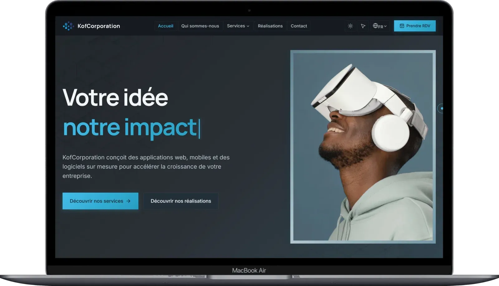
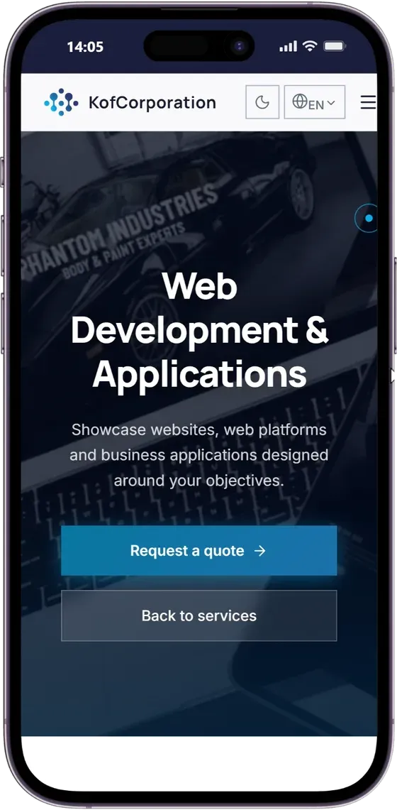
The problem
A company that sells web development was showing a slow website, hard to read on a phone, that nobody in-house could update without calling a contractor, and available in French only.
First, an audit
The assignment started with an audit of the old site, delivered as a report: performance, SEO, accessibility, legal compliance. The company's director then entrusted me with the complete redesign.
What shipped
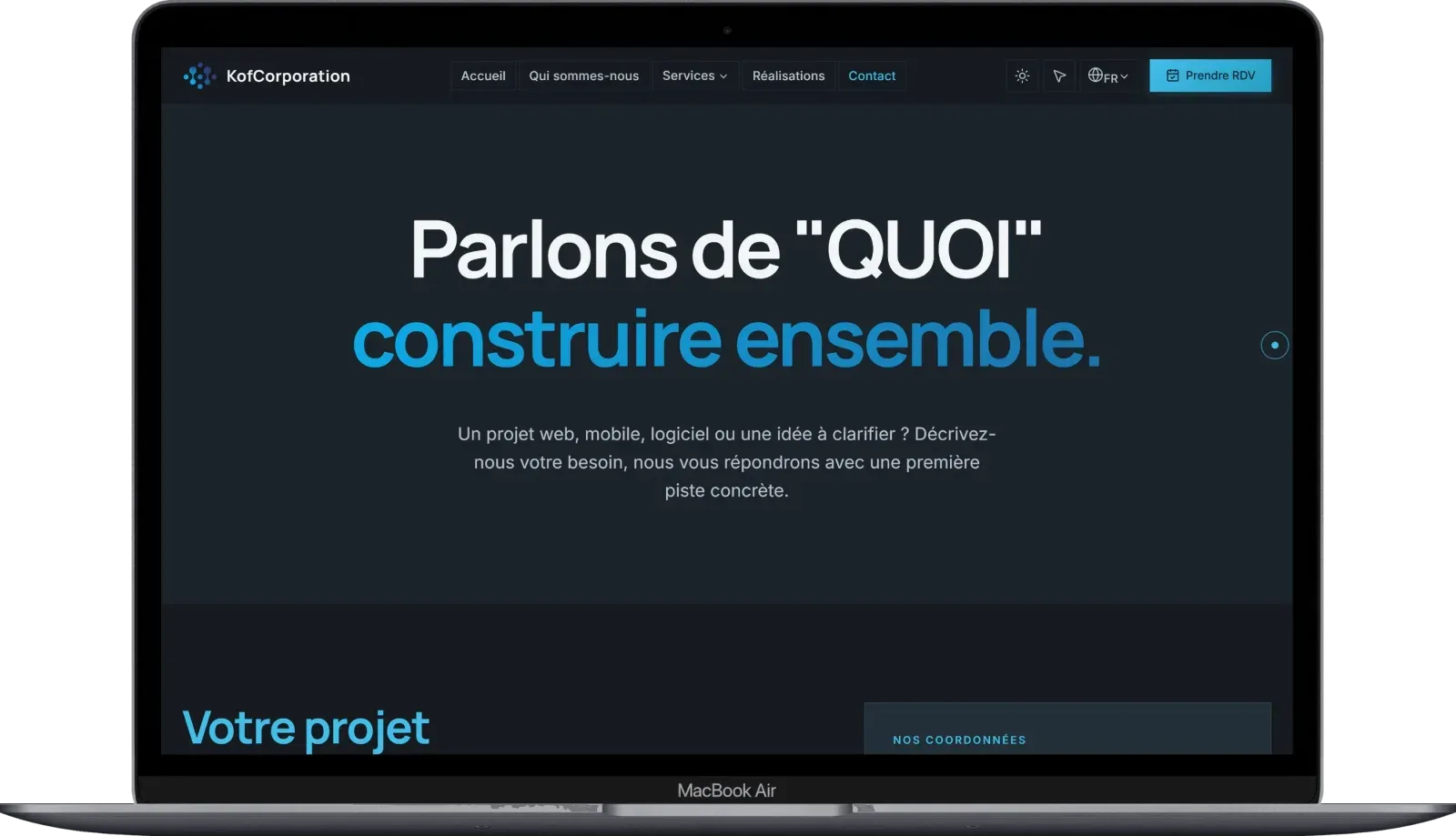
- Eleven pages in French and English, twenty-two addresses in all, with a light and a dark theme
- Five content families the company manages on its own in Sanity: projects, testimonials, partners, key figures, contact details
- Publishing that shows at once: every change in Sanity refreshes the affected page, without a redeploy
- An installable app, with an offline fallback page
- A contact form protected against bots, sent from the company's own domain
The texts, photos, logo, figures and projects come from the company: the site gives them shape, it invents nothing.
Before, after
PageSpeed Insights mobile measurements, on the home page.
- performance, old site
- 66
- performance, redesigned site
- 97
- largest image displayed, old site
- 6.8 s
- largest image displayed, redesigned site
- 1.7 s
Measured on November 13, 2026: the old site on kofcorporation.com, the new one on its delivered version plus fixes made after delivery. The current version still has to be measured again.
The decisions that matter
- A splash screen that arrived after the page. As long as it depended on JavaScript, the page showed up and was then covered. It is now rendered straight into the HTML and animated with CSS alone.
- A service worker that never installed. A fallback page declared twice made installation fail with no visible error. A single declaration was enough: 106 resources cached, checked in production.
- A mobile illustration against display time. Adding an image to the mobile hero pushed display time from 1.7 to 3.8 seconds. The answer: a cropped 11 KB version instead of 1.1 MB, requested first. The new measurement is still to be taken.
- Editable content without losing server rendering. Typed queries run on the server, with a tagged cache that a webhook invalidates on every publication.
- A decorative cursor that gets in nobody's way. Loaded only with a mouse, turned off when the visitor asks for less motion, never on touch screens.
What is left to improve
The project has no automated tests: quality rests on typing, linting and the review of every pull request. The three presentation videos weigh 17 MB and still need an encoding suited to mobile.
The stack
Next.js 16 (App Router), React 19, TypeScript, a hand-written design system in CSS variables, Framer Motion. Sanity v5 and GROQ. next-intl. Serwist for installation. Nodemailer and reCAPTCHA v3. Vercel, Analytics and Speed Insights.
The site runs on its Vercel address until the company's domain is switched.